Moodboarding & Palette Formation
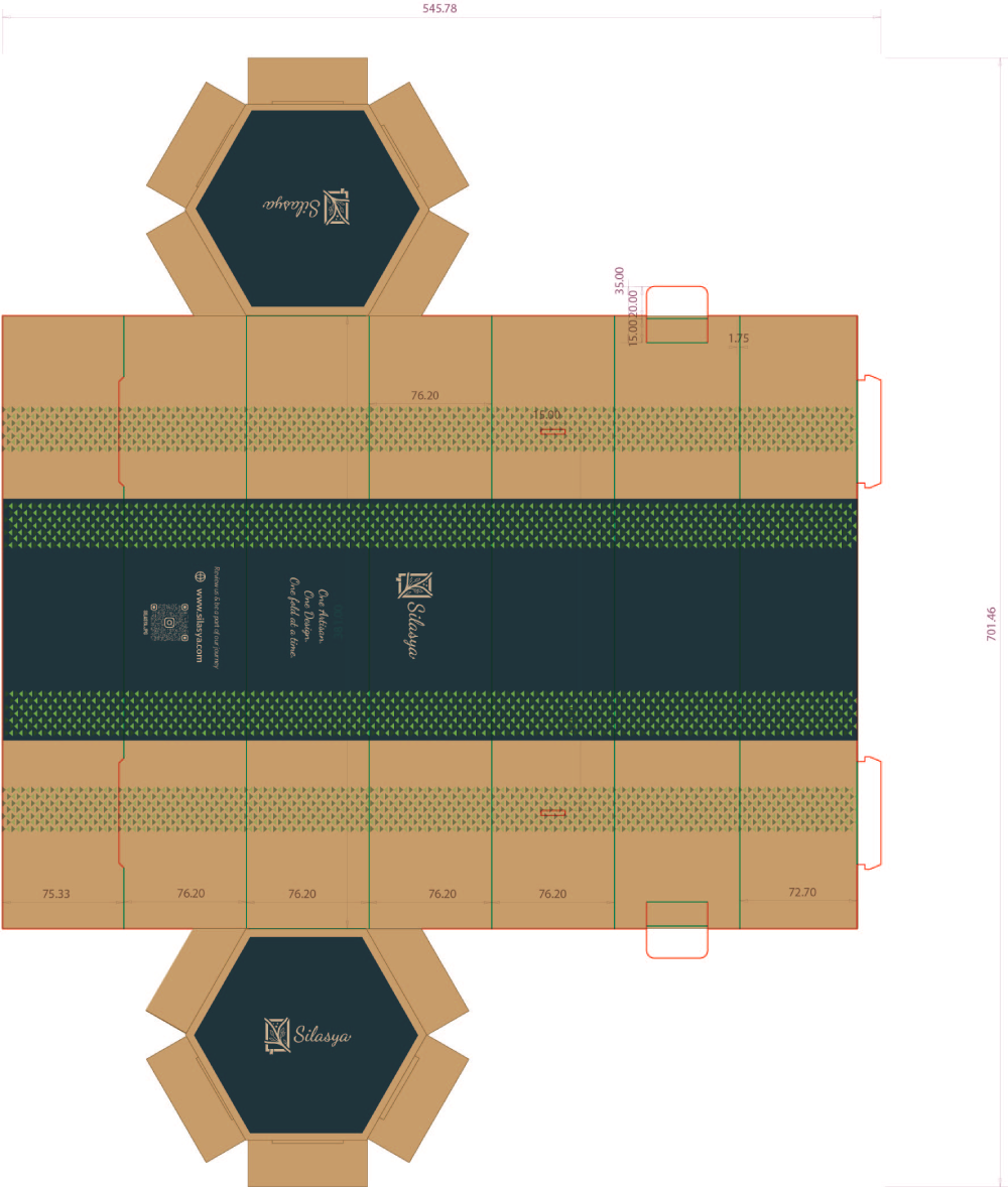
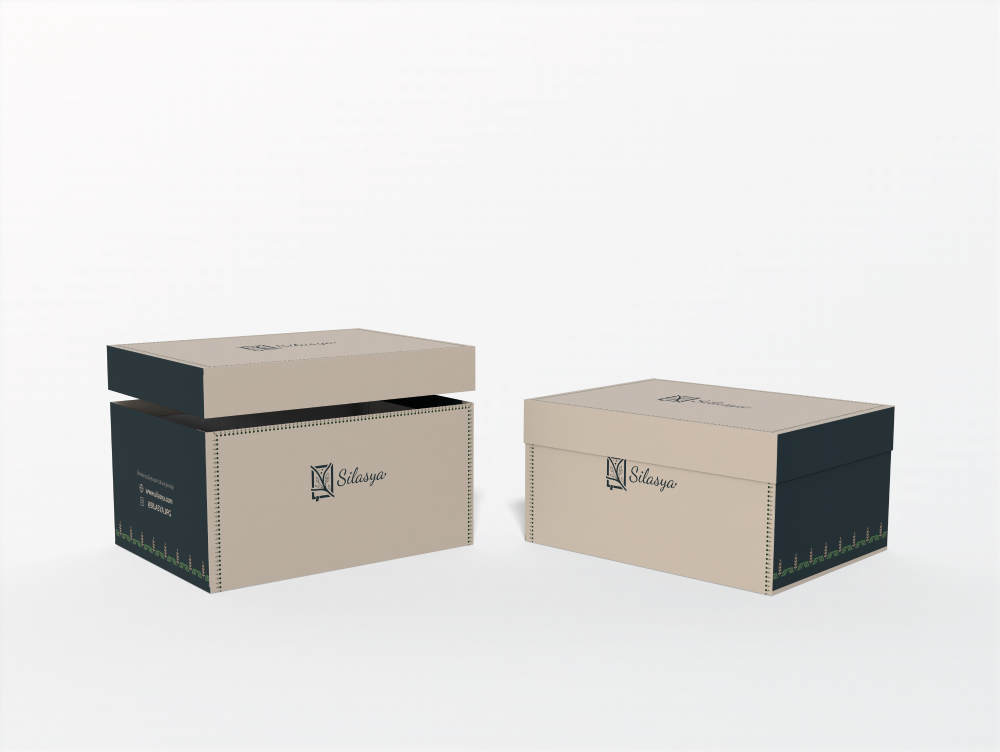
We crafted a calming palette of soft neutrals and earthy tones that paired seamlessly with hand drawn, Warli inspired patterns. These patterns minimal and nature driven were used to subtly enhance surface design without overpowering the structure.
Concept Iteration
Layouts were refined to ensure typography remained clean and legible while allowing enough white space for the materials and patterns to breathe. We focused on creating a luxury packaging feel with an eco friendly and handcrafted sensibility.
Artwork Refinement
By leveraging light opacity shifts and small-scale patterning, we embedded subtle references to traditional Indian art without compromising modernity. The motifs were placed selectively some peeking from the edges, others wrapping gently giving each package a distinctive, elegant rhythm.


.png)
